Saturday, April 23, 2016

Another Molno-Trapani Dell effort--Rango (1967)

Recently, at his excellent Who Created the Comic Books? blog, Martin O'Hearn identified three Bill Molno/Sal Trapani stories at one of my all-time favorite series, Dell's Flying Saucers.  Martin's post put me on the lookout for more Dell Molno pencil jobs--and I found some.  My first find: Dell's one-shot comic book version of a show I vaguely remember--Tim Conway's Rango.  In fact, all I recall for sure is the show's name and the fact that Tim Conway was in it!  (Not the most vivid of childhood TV memories.)  Thanks to Lorne Greene's 1964 Top-40 hit, Ringo, I knew, at age 10, that "Rango" was a pun on the Old West Ringo, vice the Beatles' drummer.  Otherwise, I'd have been wondering....

How do I know it's Bill on the pencils?  Well, first off, I checked over the issue's four stories for any examples of Bill's signature left-to-right action panel.  No fewer than six showed up!


Then I searched for any familiar faces.  Here's Rango's long-suffering Captain:


And here's a villain from "Rapwell's Kid," in the Jan., 1959, #44 issue of Charlton's Tex Ritter Western (pencils: Molno/inks: Trapani).The man has barely changed in eight years, though he's either bought a new hat or dyed the old one:


And what about Rango's sarcastic sidekick, Pink Cloud?  Let's compare these two Rango panels....


...to these two Molno Charlton panels from "Young Eagle's Protege" (Young Eagle #4, January 1957; poss. inked by Dick Giordano):


Uncanny, no?  Or how about this left half of a Rango panel, showing a stagecoach speeding off in a cloud of dust...


...and this Molno-Trapani Charlton panel from "Holdup!"? (Kid Montana #30, Aug., 1961)....
                                   

And this might be Rango's oddest reuse of a Charlton image.  It's the title character, hurling (dropping?) a barrelful of explosive biscuits (don't ask) toward a group of bad guys as they advance:


And here's an earlier version of this image, from Charlton's Billy the Kid #27  ("The Stupid Dude," March, 1961, Bill Molno/Vince Alascia).


Finally, I can't help finding this Rango panel highly similar, in design and feel, to the Molno/Mastroserio Charlton image shown below it:


I am totally sure that Rango's pencils are Molno's.  This comic book is a fun and pleasant period piece, the stories effectively told, and with some especially creative panels in the third story, "The Last Stage Out of Here" (once we get past the mundane images leading up to the perilous stage journey).

Coming up: more Molno-Trapani at Dell!


Lee

Friday, April 1, 2016

More Molno-Trapani at Gold Key--"The Room of Madness"!

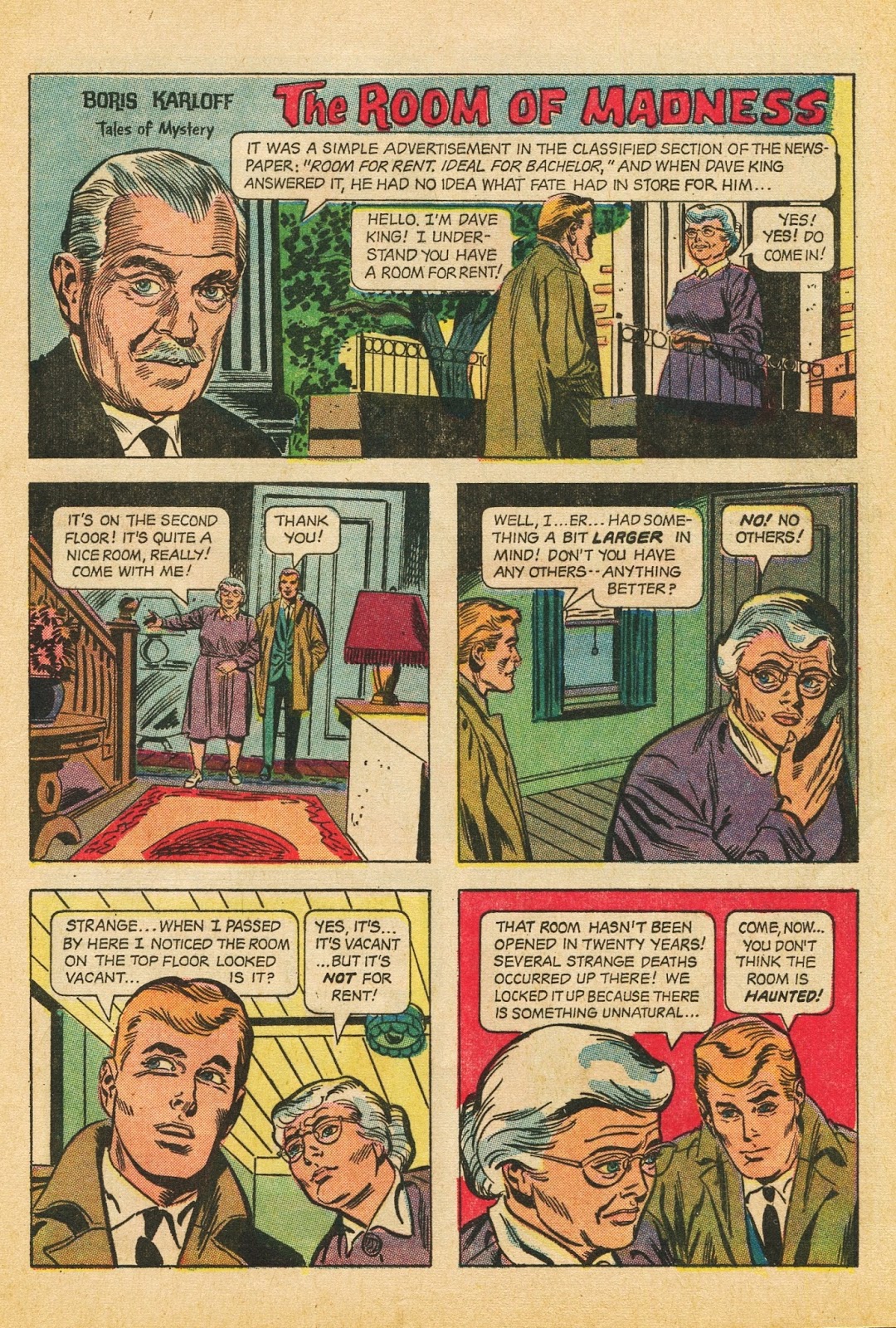
"The Room of Madness" (Boris Karloff Tales of Mystery, June, 1967) creeped me out pretty thoroughly back in the day, and, revisiting this item nearly fifty years later, I can see why--namely, because it is pretty dang creepy!  As a young reader, I had a much easier time experiencing comic book stories one panel at a time, fully getting inside of the action--something I can't do nearly as well these days, with my eyes, for some inexplicable reason, wanting to scan entire pages at once.  Then again, when it's a story about a haunted room that suffocates its unfortunate tenants, maybe it's best to stay outside of the action....


Boy, did those three panels spook me out back in the day, even if the "Aagghh!" panel had me wondering how, if the guy was being smothered by the room, a fully audible "Aagghh!" would have been possible, even an "Aagghh!" in conservatively sized font.  Apparently, I had less trouble accepting the general premise of a shrinking room (one capable of returning to its original size with no damage done to its non-human contents).  But the non-muffled "Aagghh!"?  That struck my ten year old brain as a little too much.  I should have written the publishers a letter expressing my skepticism.  ("Gentlemen, a fully audible 'Aagghh!,' such as the one featured in the third-to-last panel, strikes me as highly improbable under the circumstances.")

Nowadays, the art strikes me as quite basic but ingenious, which, not coincidentally, describes the layout style of Bill Molno to a tee.  And I'm pretty certain Bill did the pencils on this one.

Here's first page of "The Room of Mandess," just to give us a feel for the layout.  Even without peeking at the Grand Comics Database credits, we can see that the inks are Sal Trapani's....


And, right off, we're seeing classic Bill Molno faces--the old lady, the blonde hero.  Take the latter's profile in panel 3:


Compare it to this Bill Molno-Sal Trapani Charlton panel excerpt from Sep., 1959 (Unusual Tales #18,"The Incredible Walking Stick").  Kind of suggests the same collaborators, no?


On page 3 of  "The Room of Madness," we encounter a similar profile:


Let's compare it to this portion of an Oct., 1964 Molno-Molno Charlton panel (Strange Suspense Stories #72, "Fantasy Between the Pages").  Even with Molno doing his own inking, similar details stand out: collar, hairstyle, rigid pose, the way the background details function....  


And, again, to the 1959 Molno-Trapani Charlton panel:


By page four, our hero has figured out that, yes, the room is shrinking.  All haunted-room tales have their obligatory "I should have listened to the landlord" moment, and this is it.  Compare this Gold Key panel...


...to this July, 1959 Molno-Mastroserio Charlton panel (Out of This World #14, "Device 233").  All that's missing is the tape measure:


The best case-for-Molno panel is this one, which turns out to be a standard Molno construct.  Observe the raised arm, the left-to-right action, the tilted perspective, and the general angularity:


Now, for comparison, six very similar Molno Charlton panels.  (There are likely scores more of these to be found):


Not to mention this panel from the Molno-Trapani Gold Key Boris Karloff story, "The Guardians," which I covered last post:


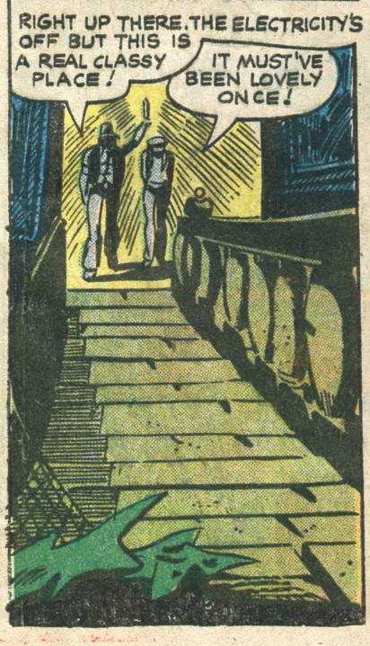
And, finally, those incredibly tall male characters in the final "Room of Madness" panel?  We've seen them before...


...in, for example, this Molno-Vince Alascia Charlton composition (Strange Suspense Stories #49, "The Old Well"):


I truly believe that "The Room of Madness" features Bill Molno ghost-penciling for Sal Trapani.  And what more appropriate place to ghost-pencil than Boris Karloff Tales of Mystery?  (Chortle)


Lee


I.D.'s for the six Charlton panels, with pencils followed by inks:

1. Texas Rangers in Action #26, "Brother vs. Brother," Feb., 1961.  Molno-Rocco Mastroserio?
2.  Outlaws of the West #19, "The Owlhooter," Apr., 1959.  Molno-Vince Alascia
3.  Outlaws of the West #13, "The Man Who Wanted War," Dec., 1957.  Molno-Molno.
4.  Fightin' Army #22, "Old Nick's Last Charge," Nov., 1957.  Molno-Alascia?
5.  Texas Rangers in Action  #23. "Ranger in Exile," Aug., 1960.  Molno-Alasica
6.  Texas Rangers in Action #23, "Saddle Tramp," Aug., 1960.  Molno-Alascia.


Thursday, March 3, 2016

Bill Molno at Gold Key!

I vividly remember the December, 1968, no. 24 issue of Boris Karloff Tales of Mystery from back in the day, if only because the final story ("The Guardians") had obviously been intended for Gold Key's The Twilight Zone.  Two things indicate as much: 1) The science-fiction nature of the story, atypical for the TOM series (at that time, anyway), and 2) the opening and closing narrations by the cartoon Karloff, both of which mention The Twilight Zone.  Kind of a dead giveaway, there.  At least they thought to replace cartoon Rod Serling with cartoon Boris, even if they forgot to alter the text.

I always thought "The Guardians" felt much more like The Outer Limits than TZ, but Dell had the rights to the former show, so we got it as a TZ entry, albeit reassigned to TOM.  There must be an interesting story behind that.

At any rate, the story is wonderfully illogical, with the intrepid reporter instantly recognizing the three brain-zapped scientists now wandering the alleys as bums ("Of course!  Dr. Stroller, the Nobel Prize winner in biochemistry!").  Highly fun, and with plenty of space (twelve pages) in which to tell it.  Here's the cover, title page, and two sample panels:


The Grand Comics Database credits pencils and inks to Sal Trapani, but the pencils sure look like Bill Molno to me.  This is one of those instances in which my level of certainty is complete.  Below I've positioned "Guardian" panels above and/or next to Charlton Molno panels, to hopefully demonstrate that we're looking at the same penciller:


Above: "The Guardians"


Above: Molno/Alascia--"The Negative View," Mysteries of Unexplored Worlds #17, March, 1960.


Above: "The Guardians"


Above: Molno/Trapani ("Moltra")--"The Sixth Moon of Saturn," Space War #8, Dec., 1960


Above: "The Guardians"


Above: Molno/Mastroserio--"The Time Cap," Unusual Tales #20, Jan., 1960


Above: Same


Above: "The Guardians"


Above: Molno/Trapani--"The Incredible Walking Stick," Unusual Tales #18, Sep., 1959


Above: three-panel layout from "The Guardians"


Above: Very similar three-panel layout from "The Comfort Crystal!"--Molno/Trapani, Unusual Tales #13, Sep., 1958


Above: "The Guardians"


Above: Molno--"The Last Will and Testament," Haunted #29, Sep., 1976.


Above: "The Guardians"


Above: Molno/Alascia, "The Snail from Uranus," Space War #13, Oct., 1961


Above: "The Guardians"


Above: Molno--"Chicken," Fightin' Marines #127, Jan., 1976

At the moment, I'm looking at three other Tales of Mystery stories that I suspect to be Molno/Trapani combos.  Stay tuned!

Lee


Wednesday, February 24, 2016

A "Look What's Coming!" Classics Illustrated Poe title that never came....

In my first edition copy (woo-hoo!) of Classics Illustrated #56, Toilers of the Sea (Victor Hugo), from Feb., 1949, the inside back cover includes this exciting blurb:


The Mask of Red Death, scheduled for publication!  (By which we can assume they meant Edgar Allan Poe's The Masque of the Red Death.)  In fact, this was at least the second CI notice for The Mask of Red Death.  So, you wonder, did their version turn out to be worth the wait?

I have no idea--it never happened.  Of all the CIs that never were, The Mask of Red Death may be the one that most deserved to happen, if only because CI had such a way with Poe.  But CI was moving away from horror about the time they made the above announcement (or away from horror covers, anyway), so it's highly possible that Mask got penciled out.  Darn.  If only they'd gotten to it a few years earlier.  What would a Henry C. Kiefer Red Death cover have looked like?  Awesome, I'm guessing.

But 1949 was the year that CI redid the covers to Dr. Jekyll and Mr. Hyde, Twenty Years After, and The Hunchback of Notre Dame, making them less gruesome (or, in the case of Hyde and Hunchback, less hilarious).  And how were they going to do a non-horror Mask of Red Death cover?  Would that even be possible?

And how were they going to soften passages like, "No pestilence had ever been so fatal, or so hideous. Blood was its Avator and its seal--the redness and the horror of blood"?  Paraphrase it as, "The Red Death was bad news"?

Maybe they were planning to issue Mask with The Gold Bug, and then they scrubbed Mask, and Bug became the lead Poe story in the issue to come, if only because it didn't require horrific cover art.  Maybe I'm babbling.  In any event, The Gold Bug was still two years away when this "Look What's Coming!" announcement appeared.

In a just universe, a CI Mask of Red Death would have happened.  Oh, well.  No point obsessing over it (though that's never stopped me).

The 1949 Toilers of the Sea featured gorgeous art by August M. Froehlich, though the adaptation left out a few too many story details, in my opinion (a problem corrected in the 1962 revamp):


Lee