Thursday, March 3, 2016

Bill Molno at Gold Key!

I vividly remember the December, 1968, no. 24 issue of Boris Karloff Tales of Mystery from back in the day, if only because the final story ("The Guardians") had obviously been intended for Gold Key's The Twilight Zone.  Two things indicate as much: 1) The science-fiction nature of the story, atypical for the TOM series (at that time, anyway), and 2) the opening and closing narrations by the cartoon Karloff, both of which mention The Twilight Zone.  Kind of a dead giveaway, there.  At least they thought to replace cartoon Rod Serling with cartoon Boris, even if they forgot to alter the text.

I always thought "The Guardians" felt much more like The Outer Limits than TZ, but Dell had the rights to the former show, so we got it as a TZ entry, albeit reassigned to TOM.  There must be an interesting story behind that.

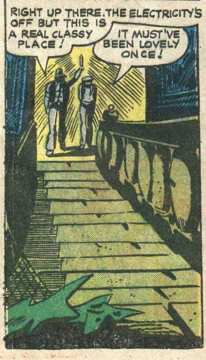
At any rate, the story is wonderfully illogical, with the intrepid reporter instantly recognizing the three brain-zapped scientists now wandering the alleys as bums ("Of course!  Dr. Stroller, the Nobel Prize winner in biochemistry!").  Highly fun, and with plenty of space (twelve pages) in which to tell it.  Here's the cover, title page, and two sample panels:


The Grand Comics Database credits pencils and inks to Sal Trapani, but the pencils sure look like Bill Molno to me.  This is one of those instances in which my level of certainty is complete.  Below I've positioned "Guardian" panels above and/or next to Charlton Molno panels, to hopefully demonstrate that we're looking at the same penciller:


Above: "The Guardians"


Above: Molno/Alascia--"The Negative View," Mysteries of Unexplored Worlds #17, March, 1960.


Above: "The Guardians"


Above: Molno/Trapani ("Moltra")--"The Sixth Moon of Saturn," Space War #8, Dec., 1960


Above: "The Guardians"


Above: Molno/Mastroserio--"The Time Cap," Unusual Tales #20, Jan., 1960


Above: Same


Above: "The Guardians"


Above: Molno/Trapani--"The Incredible Walking Stick," Unusual Tales #18, Sep., 1959


Above: three-panel layout from "The Guardians"


Above: Very similar three-panel layout from "The Comfort Crystal!"--Molno/Trapani, Unusual Tales #13, Sep., 1958


Above: "The Guardians"


Above: Molno--"The Last Will and Testament," Haunted #29, Sep., 1976.


Above: "The Guardians"


Above: Molno/Alascia, "The Snail from Uranus," Space War #13, Oct., 1961


Above: "The Guardians"


Above: Molno--"Chicken," Fightin' Marines #127, Jan., 1976

At the moment, I'm looking at three other Tales of Mystery stories that I suspect to be Molno/Trapani combos.  Stay tuned!

Lee


Wednesday, February 24, 2016

A "Look What's Coming!" Classics Illustrated Poe title that never came....

In my first edition copy (woo-hoo!) of Classics Illustrated #56, Toilers of the Sea (Victor Hugo), from Feb., 1949, the inside back cover includes this exciting blurb:


The Mask of Red Death, scheduled for publication!  (By which we can assume they meant Edgar Allan Poe's The Masque of the Red Death.)  In fact, this was at least the second CI notice for The Mask of Red Death.  So, you wonder, did their version turn out to be worth the wait?

I have no idea--it never happened.  Of all the CIs that never were, The Mask of Red Death may be the one that most deserved to happen, if only because CI had such a way with Poe.  But CI was moving away from horror about the time they made the above announcement (or away from horror covers, anyway), so it's highly possible that Mask got penciled out.  Darn.  If only they'd gotten to it a few years earlier.  What would a Henry C. Kiefer Red Death cover have looked like?  Awesome, I'm guessing.

But 1949 was the year that CI redid the covers to Dr. Jekyll and Mr. Hyde, Twenty Years After, and The Hunchback of Notre Dame, making them less gruesome (or, in the case of Hyde and Hunchback, less hilarious).  And how were they going to do a non-horror Mask of Red Death cover?  Would that even be possible?

And how were they going to soften passages like, "No pestilence had ever been so fatal, or so hideous. Blood was its Avator and its seal--the redness and the horror of blood"?  Paraphrase it as, "The Red Death was bad news"?

Maybe they were planning to issue Mask with The Gold Bug, and then they scrubbed Mask, and Bug became the lead Poe story in the issue to come, if only because it didn't require horrific cover art.  Maybe I'm babbling.  In any event, The Gold Bug was still two years away when this "Look What's Coming!" announcement appeared.

In a just universe, a CI Mask of Red Death would have happened.  Oh, well.  No point obsessing over it (though that's never stopped me).

The 1949 Toilers of the Sea featured gorgeous art by August M. Froehlich, though the adaptation left out a few too many story details, in my opinion (a problem corrected in the 1962 revamp):


Lee

Tuesday, September 29, 2015

"A Mate for Konga" (1962)


"Not one... but two!  'A Mate for Konga'" shouts the Steve Ditko Dick Giordano cover (either inks alone, or pencils and inks) shown above. (Correction courtesy of Nick Caputo.)  Charlton's The Return of Konga  (January, 1962) appeared between no.'s 4 and 5 of the company's Konga series, and it contains two Konga concoctions and a six-page filler piece called "The Monster Hunter."  All feature Bill Molno on pencils and inks.  His art, here as elsewhere, is beautifully spare and eccentric.

Here is Molno's superb (if a little out of scale) splash panel for "Mate," depicting Konga and his grown-in-a-jar mate, Torga, as they show up, unannounced and uninvited, on the shores of San Francisco.  That's Konga in back, staring on, puzzled, as Torga goes ape:


Anyway, as our story begins, Konga is living all alone on a "far tropical isle," and not looking too thrilled about it....


Before he knows it, though, he'll have plenty of company--evil Soviet company.  (In 1962 pop culture, "Soviet" equalled evil.)  It seems that a cracked but brilliant Soviet scientist knows where Konga is and longs to use the apes' giant body cells so that he can give them "specialization," which I guess means giving them the ability to form into specific body parts, which is not what "cell specialization means," but this is a Charlton comic.  Normal-sized cells are useless, as they're not big enough to specialize.  In these expressionistic panels, Molno presents the scientist as a raving nut, which, in 1962, also went with "Soviet":


More horror-film imagery as an "august body of high Soviet officials" (all evil, we can presume) agrees to underwrite the prof's giant-cell-gathering expedition.  But of course.  In 1962, Soviet science equaled weird science, at least in comic books:


To the island they go, in an awesome panel featuring one of Molno's most memorable sea scenes:


Of course, once landed, they soon encounter Konga:


                                                                     "You rang??"


In the story's most inspired-by-King-Kong panel, Konga stands there, hoping these Soviet humans are good humans.  I guess he hasn't read many comic books....


So much for that hope.  In an image almost straight out of the 1957 B-movie classic, The Amazing Colossal Man, a giant hypo pops forth....


And Comrade Professor gets his jar of giant cells....


Back to the lab, where Konga's cells, placed into a jar, form into an "entity" that looks very Konga-like--only, for the moment, much smaller:


Two panels later, it's a whole different kettle of cells....


Torga is coaxed into a cage, where she is later joined by Konga, who finds the lovely Torga the answer to his prayers....


Or maybe not....


Using the knowledge gleaned from his successful specialization of giant Konga cells, the evil professor wants to "build a race of Soviet supermen" from human cells.  But his scheme is put on hold by his superiors, who arrive by sub to take Konga and Torga to San Francisco without delay as part of a scheme to steal American nuclear plans.  Love these panels and their red color scheme:


Conveniently, an earthquake happens just as the giant apes are loaded for their journey to SF.  The evil professor, of course, attempts to retrieve his records....


And the bad guy (and his notes) go bye-bye:


After a long trip by Soviet sub, Konga and his mate are released just off the coast of San Francisco:


This sets the stage for my favorite "Mate for Konga" panel, wherein evil Torga goes on a brief SF-trashing rampage.  She ignores Konga's cries to split the scene, preferring instead to split some buildings....


The Soviets accidentally kill Torga with a shot meant to dissuade the giant apes from retreating to the sea, and a sad Konga carries her off....


Thus ends one of the craziest and most enjoyable of all Joe Gill/Bill Molno Chartlon efforts.  


Lee

Thursday, September 3, 2015

Alan Class Bill Molno reissues, Part 1

What to call this post?  That was the question.  "Alan Class Bill Molno reissues" is pretty awkward, but it's much better than any of my attempted word play on the word "class" (or, in this case, "Class").  So I'll stick with "Alan Class Bill Molno reissues."  After all, in the grand scheme of things, what's a comic-blog post title?  Sure, it has my name on it, and, sure, it'll be archived forever on the internet, but so will fifty zillion other mundane, ephemeral things.  One of these days, mankind will ask itself why the heck it's archiving everything on the internet, but for now we're simply answering some nameless imperative, I guess.  While the planet heats up and wars rage, we can rest easy, knowing that every gem of Twitter snark and blog commentary is being preserved for future generations of humans.

Where was I?  Yes, Alan Class Bill Molno reissues.  We (hopefully) know who Bill was, but who was Alan?  Alan Class, of course, was the keyboardist for the Animals.  No, wait.  This Alan Class was the British publisher who, from 1959 to 1989, printed cheap black and white newsstand digests of reprinted material from Charlton, Marvel, Atlas, Fawcett, and other American comic outfits. While stationed in Scotland in the late 1970s and early 1980s, I would buy these things to read on the train to Edinburgh--and promptly pitch them afterwards.  They were the sort of things you read and pitch.  They practically had "Read and pitch" stamped on them.

Getting back in touch with these things (on GCD--where else?) was an exciting moment of nerdstlgia.  "Hey, these are things I read on the train!"  And, lest I think I made up "nerdstalgia," a Google search of the phrase yields 7,000+ matches.  Darn.

Here are two recent Class-digest buys, and both of them sport reprinted Charlton covers (Out of This World, No. 2, Dec., 1956; and Unusual Tales, No. 17, July, 1959).  And the first one is actually called Out of This World, and it contains Out of This World reprints, and I'm wondering why I didn't pick a less confusing hobby like astrophysics:


The first cover is Molno on pencils--the second is Molno on the right.  Both digests are packed with plenty of Bill.  It all starts with the 1956 Molno/Alascia (Molno/Mastroserio?) entry,"The Man with a Screw Loose."  Word of explanation: the E.T.s of the first panel are wearing hoods so Earthlings will take them for "members of a religious order."  (The Church of DC Comics?):


The story comes complete with an alien abduction, an alien operating room, and a paralyzed Earth man on a table wondering what the heck is going on.  Normally, this would be set aboard a flying saucer, but here, it's somewhere in the city of Pnobiti, on the (former) planet Pluto.  A city which isn't even mentioned on NASA's New Horizons website.  What gives?  I smell a conspiracy:


"Venus Stopover" shows up next, with quite cool space art by Molno and inker Sal Trapani. (Seeing this stuff in non-color can be a revelation, and often is.)  God, do I love these kinds of blatantly inaccurate period depictions of space, complete with, um... a giant space amoeba?  What in the heck is that wispy thing?  Maybe the ship just cleared its septic tanks (which we'd hope they'd be doing in deeper space, just as a courtesy....):


More views of the classic "Stopover" spaceship.  Molno's unpretentious design couldn't be cooler:


Bill returns in the fourth c.-1974 Class Out of This World entry, "The Terrible Plant Earth" (yes, "Plant Earth," from Space War, No. 8,  Dec., 1960), with inks by Vince Alascia.  Giant Molno space reptiles are my favorite type, and they're all over this one.  And I consider Molno's mass-panic scenes the best in the history of comics, if only due to the brilliant economy of execution: typically, five or six people in front, with a scribbled, impressionistic representation of hundreds (thousands?) more coming up the rear.  Bill knew how to suggest things, how to create the impression of space vice imitating real space.  Why use a large canvas to suggest big action, when the art of suggesting is the art of implying?  Do what Molno does--compress the action, use a minimum of basic detail to suggest, say, all hell breaking loose on a distant world and/or a future Earth.  Skilled impressionists don't distort reality so much as reduce it to its essence.  "Suggestivism" has the wrong connotation, which may be why "impressionism" became the standard word.  By the way, have I ever mentioned how much I love Molno?:


Two stories later, we have the finished-in-five-pages Molno/Alascia? entry, "Dredge from the Unknown" (Space Adventures, No. 25, Sep., 1958), which closes with a great, old-fashioned space battle, depicted in the best Molno manner--i.e., from weird angles in a series of scrunched compositions:


Next up is Juggernaut of Doom, featuring Molno pencils and Mastroserio inks.  The Moon-like meteorite and the gigantic spaceship interior are, to this writer, the art highlights, and the blow-'em-up finale is classic Charlton weirdness, with the deflected meteorite going "VVROOOMMM, VVROOOMM."  ("Vvrooommm, Vvrooommm"??) I thought deflected meteorites made a sound more like "SWOOOOSH," but of course I don't actually know this:


The Molno/Trapani In a Twinkling (from July, 1959) finishes the first issue's Molno-athon, though it's not up to the same pair's Venus Stopover.  The kitchen-appliance spacecraft is very period, but kind of stodgy.  (Is the "but" redundant?)  Its descent into the (time-frozen) city is an excellent composition, though.  I love the way a tall, scrunched panel is used to depict this.  As always, Molno has perfectly contained the action, and dig the use of squiggly lines to depict a street full of people.  (Or is the street covered in Tapioca?  The vehicles appear to be submerged in something; very weird.)

Do Molno's E.T.s all rent their cape suits from the same supplier?


In the second panel, a common feature of Molno's comic art: a character or object moving stiffly through the air like a two-dimensional cardboard cutout:


Yet, as we can see in this page scheduled for my Part-2 post, Molno was quite capable of having his characters' bodies twist realistically as they are lifted through space.  I guess it depended on his mood at the time?


If I had to describe Molno's art in two words, those two words might be, "stylistically unpredictable."

More to come!


Lee