Thursday, September 3, 2015

Alan Class Bill Molno reissues, Part 1

What to call this post?  That was the question.  "Alan Class Bill Molno reissues" is pretty awkward, but it's much better than any of my attempted word play on the word "class" (or, in this case, "Class").  So I'll stick with "Alan Class Bill Molno reissues."  After all, in the grand scheme of things, what's a comic-blog post title?  Sure, it has my name on it, and, sure, it'll be archived forever on the internet, but so will fifty zillion other mundane, ephemeral things.  One of these days, mankind will ask itself why the heck it's archiving everything on the internet, but for now we're simply answering some nameless imperative, I guess.  While the planet heats up and wars rage, we can rest easy, knowing that every gem of Twitter snark and blog commentary is being preserved for future generations of humans.

Where was I?  Yes, Alan Class Bill Molno reissues.  We (hopefully) know who Bill was, but who was Alan?  Alan Class, of course, was the keyboardist for the Animals.  No, wait.  This Alan Class was the British publisher who, from 1959 to 1989, printed cheap black and white newsstand digests of reprinted material from Charlton, Marvel, Atlas, Fawcett, and other American comic outfits. While stationed in Scotland in the late 1970s and early 1980s, I would buy these things to read on the train to Edinburgh--and promptly pitch them afterwards.  They were the sort of things you read and pitch.  They practically had "Read and pitch" stamped on them.

Getting back in touch with these things (on GCD--where else?) was an exciting moment of nerdstlgia.  "Hey, these are things I read on the train!"  And, lest I think I made up "nerdstalgia," a Google search of the phrase yields 7,000+ matches.  Darn.

Here are two recent Class-digest buys, and both of them sport reprinted Charlton covers (Out of This World, No. 2, Dec., 1956; and Unusual Tales, No. 17, July, 1959).  And the first one is actually called Out of This World, and it contains Out of This World reprints, and I'm wondering why I didn't pick a less confusing hobby like astrophysics:


The first cover is Molno on pencils--the second is Molno on the right.  Both digests are packed with plenty of Bill.  It all starts with the 1956 Molno/Alascia (Molno/Mastroserio?) entry,"The Man with a Screw Loose."  Word of explanation: the E.T.s of the first panel are wearing hoods so Earthlings will take them for "members of a religious order."  (The Church of DC Comics?):


The story comes complete with an alien abduction, an alien operating room, and a paralyzed Earth man on a table wondering what the heck is going on.  Normally, this would be set aboard a flying saucer, but here, it's somewhere in the city of Pnobiti, on the (former) planet Pluto.  A city which isn't even mentioned on NASA's New Horizons website.  What gives?  I smell a conspiracy:


"Venus Stopover" shows up next, with quite cool space art by Molno and inker Sal Trapani. (Seeing this stuff in non-color can be a revelation, and often is.)  God, do I love these kinds of blatantly inaccurate period depictions of space, complete with, um... a giant space amoeba?  What in the heck is that wispy thing?  Maybe the ship just cleared its septic tanks (which we'd hope they'd be doing in deeper space, just as a courtesy....):


More views of the classic "Stopover" spaceship.  Molno's unpretentious design couldn't be cooler:


Bill returns in the fourth c.-1974 Class Out of This World entry, "The Terrible Plant Earth" (yes, "Plant Earth," from Space War, No. 8,  Dec., 1960), with inks by Vince Alascia.  Giant Molno space reptiles are my favorite type, and they're all over this one.  And I consider Molno's mass-panic scenes the best in the history of comics, if only due to the brilliant economy of execution: typically, five or six people in front, with a scribbled, impressionistic representation of hundreds (thousands?) more coming up the rear.  Bill knew how to suggest things, how to create the impression of space vice imitating real space.  Why use a large canvas to suggest big action, when the art of suggesting is the art of implying?  Do what Molno does--compress the action, use a minimum of basic detail to suggest, say, all hell breaking loose on a distant world and/or a future Earth.  Skilled impressionists don't distort reality so much as reduce it to its essence.  "Suggestivism" has the wrong connotation, which may be why "impressionism" became the standard word.  By the way, have I ever mentioned how much I love Molno?:


Two stories later, we have the finished-in-five-pages Molno/Alascia? entry, "Dredge from the Unknown" (Space Adventures, No. 25, Sep., 1958), which closes with a great, old-fashioned space battle, depicted in the best Molno manner--i.e., from weird angles in a series of scrunched compositions:


Next up is Juggernaut of Doom, featuring Molno pencils and Mastroserio inks.  The Moon-like meteorite and the gigantic spaceship interior are, to this writer, the art highlights, and the blow-'em-up finale is classic Charlton weirdness, with the deflected meteorite going "VVROOOMMM, VVROOOMM."  ("Vvrooommm, Vvrooommm"??) I thought deflected meteorites made a sound more like "SWOOOOSH," but of course I don't actually know this:


The Molno/Trapani In a Twinkling (from July, 1959) finishes the first issue's Molno-athon, though it's not up to the same pair's Venus Stopover.  The kitchen-appliance spacecraft is very period, but kind of stodgy.  (Is the "but" redundant?)  Its descent into the (time-frozen) city is an excellent composition, though.  I love the way a tall, scrunched panel is used to depict this.  As always, Molno has perfectly contained the action, and dig the use of squiggly lines to depict a street full of people.  (Or is the street covered in Tapioca?  The vehicles appear to be submerged in something; very weird.)

Do Molno's E.T.s all rent their cape suits from the same supplier?


In the second panel, a common feature of Molno's comic art: a character or object moving stiffly through the air like a two-dimensional cardboard cutout:


Yet, as we can see in this page scheduled for my Part-2 post, Molno was quite capable of having his characters' bodies twist realistically as they are lifted through space.  I guess it depended on his mood at the time?


If I had to describe Molno's art in two words, those two words might be, "stylistically unpredictable."

More to come!


Lee

Wednesday, August 5, 2015

Bill Molno watercolor of Belden and Lewis Islands (Stony Creek, CT), 1991


I won this small Bill Molno watercolor (above) on eBay from a dealer who bought it from the artist in 1991!  It shows Stony Creek, CT's Belden and Lewis Islands, just two of the many Thimble Islands (which number from 100 to 365, according to a NYT piece!).  In 2013, Belden Island went on the market for a mere four million dollars (no idea whether or not it was taken).  Here's a 2013 photo of same:


Belden Island

No doubt, a reasonable asking price for such a lovely private island, though a tad pricey.  I paid considerably less for Molno's rendering.

Here's a nice aerial shot of (some of) the Thimle Islands, year unknown.  I wonder what the whole set would go for?  Enough to purchase Pluto and its moons, no doubt:


Bill lived in Branford, CT, where Stony Creek resides.  The nice eBay dealer described Bill, whom she knew, as "a fixture in the creek."  A pretty ideal spot for a watercolorist, no?  She's checking around to see if she can locate a photograph of Bill, which would be great treat!

Knock on canvas....

Lee


Wednesday, July 29, 2015

Bill Molno's demons: 1953-1976

Good grief--it's been five months since I last comic-blogged.  I didn't realize it had been that long, but the post dates don't lie.  Well, not unless the blogger changes them after the fact.  Anyway, time flies when you're doing umpteen things.  I think there's an Einstein quote to that effect.

So, with no time to snooze, let's go straight to some astoundingly good 1953 Bill Molno art.  It's from "The Sorcerer's Spectacles" (Ace's Hand of Fate, issue #17), and I scanned the panels from my own slightly fragile copy.  Inks are unknown, but the pencils are sheer, pure Bill, even if they're pretty much the antithesis of his simpler circa-1963 work for Charlton Comics (which I love just as much).  Spectacles is a typically violent pre-Code affair, in which the plot essentially exists to set up gruesome situations,  The guy who goes on an unfettered spree of evil, only to turn everything on himself in the last few panels, is a theme that would have made billions for anyone with the foresight to patent it:


The complete "Sorcerer's Spectacles" can be seen at the Ace Horror! blog: Link.

Luckily, when Bill joined Charlton, he brought his demons with him.  Here are some of his best-conceived imps and giants, most of them starring as space aliens, in designs ranging from reptilian to cyclopean.  Molno's monster faces always provide a fascinating counterpoint to his (usually) bland human mugs.

From "Terms of Surrender" (Space War #22, May 1963):


Puny pool-table inhabitants from "Behind the Eight Ball" (Mysteries of Unexplored Worlds #2, January 1957):


Not-so-little green men, from "When the Day Comes" (Space Adventures #45, May 1962):


Enemy creatures with freeze guns on Titan ("The Six Moon of Saturn," Space War #8, December 1960).  And I've always wanted to type "Enemy creatures with freeze guns on Titan":


Another reptilian bad guy, this time on Earth ("The Missionary," Scary Tales #6, July 1976);


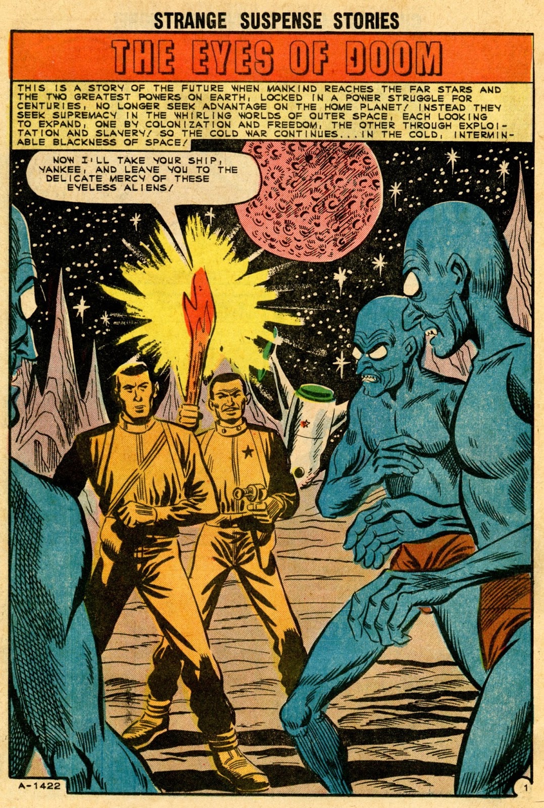
"Eyeless" blue aliens with eyes ("The Eyes of Doom," Strange Suspense Stories #61, October, 1962):


From 1964, one of Molno's coolest fiends: urbane gargoyles with antennae for horns ("The Primitives," Space War #26, June 1964).  Images from Comic Book Plus:


Red E.T.s on a red planet, light-sensitive and unable to endure heat.  Or to see in stereo.  It takes the Earth heroes all of five pages (plus ad) to defeat them.  ("Red as Blood," Space War #7, October 1960):


Finally, turquoise invaders in Dracula get-ups.  This time, it takes Earth six pages to foil their plans.  We're getting a little rusty in our responses....  ("The Sleep Rain," Space Adventures #55, January 1964):


:


Lee

Monday, February 23, 2015

Charlton space covers by Bill Molno!

For today's post, sixteen space covers by Bill Molno for Charlton Comics, most of them inked by Vince Alascia.  I'm using "space" as a catch-all for science fiction--hence, some of these images are Earth-based.  In posts to come, I'll be reviewing individual Molno-illustrated space stories, but I thought I'd start with some of his covers in/for that genre, with all but two wholly his.  Though many of these were taken from splash panels, they work superlatively as cover images.  I've put the date and issue number under each scan:


Space Adventures #46, July, 1962.  From splash panel.


Space War #11, June, 1962.  From splash panel.


Space War #15, March, 1962, from splash panel.


Out of This World #2, Dec., 1956.


Mysteries of Unexplored Worlds #28, Jan., 1962, from splash panel.


Mysteries of Unexplored Worlds #20, Sep., 1960.  Top panel; from interior art.


Mysteries of Unexplored Worlds #17, March, 1960, from splash panel.


Out of This World #15, Oct., 1959, Molno/Alascia cover.  First image based on interior art.  Not sure about the other two!


Space Adventures #41, Aug., 1961.  First two images from interior Molno/Alascia panels.


Space Adventures #28, April, 1959.


Mysteries of Unexplored Worlds #13, June, 1959.


Unusual Tales #2, Jan., 1956.


Strange Suspense Stories #58, April, 1962, from splash panel.


Space War #19, Sep., 1962, from splash panel.


Space War #13, Oct., 1961, from splash panel.


Mysteries of Unexplored Worlds #27, Nov., 1961, from splash panel.


Lee