Wednesday, November 12, 2014

Holidays at Home (1895)--Or, time for a timeline

Checking back over my records, I see that I've been looking into 19th century children's books and magazines for all of seven months, tops.  I've been investigating these things so intensely, it seems like much longer.  So I can excuse myself for not having put together a timeline for (what should I call these?) comic-like children's art and features that predate 1900.  For want of a more graceful label.

After all, data has to be mined before it can be categorized.  The first order of historical investigation is to discover what's out there, to conduct the broadest search available before slapping on the labels and hauling out the theories.  Of course, things tend to be done the other way around, don't they?

For instance, in the field of rock and roll history, the religion that r&r started with (pick one) Bill Haley and/or Elvis Presley predated any serious investigation into the history of that form.  Lazy journalists had already trapped r&r history inside a simple-minded, inflexible narrative even before actual archivists and historians (well, archivists are historians, come to think of it) had had time to announce their discovery of hundreds, possibly thousands, of pre-Bill and pre-Elvis r&r recordings.  Real historical research takes time--concocting a feel-good myth for your middlebrow white listener-ship and/or readership is a nanosecond's effort (and burns just as few calories).

Rock and roll is one of the most meticulously documented popular music forms ever, yet TV and the press treat it like an event shrouded in mystery, its roots lost to the echoes of time.  And it's no use asking people to listen to, say, rock-sounding recordings of the 1940s by Buddy Johnson or Johnny Otis, because know what they'll say?  "Sure, it sounds like rock and roll, but it's not there yet."  Not where yet?  Alas, any data that exists outside of an established narrative, no matter how ridiculously narrow or uninformed the narrative, is data to be brushed off.  And so it is.

As we speak, some highly inflexible comic-history narratives are being nailed into place--narratives that restrict the evolution of pre-Yellow Kid comics (and comic books) to the graphic satire of big-name 18th- and 19th-century illustrators, with little consideration given the general readership of the time.  I mean, who cares what everyday, ordinary folks of the 1800s might have regarded as cartoons or comics?  Apparently, you and I missed the memo that comics and cartoons are high art forms to be appreciated by, say, no more than 2.5 percent of the population (and only those who can recite the proper password) .  Cartoons and comics, pop culture?  You must be mad.

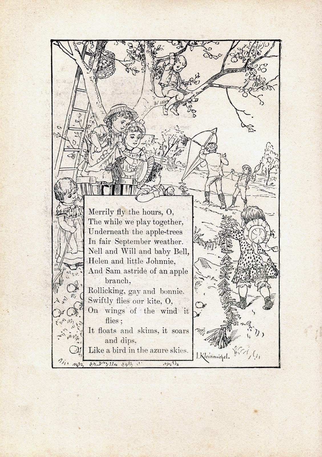
The 1895 W.B. Conkey children's publication Holidays at Home (the source of the scans featured below), was likely culled from earlier magazine illustrations and features, and, like other compilations I've sampled at this blog, it demonstrates that comic-like details were commonplace in popular publications of the late 1800s (in this case, of course, a publication for small children).  To my eyes, the mergings of text and art that we see in some of these examples are the logical antecedent to the text/image arrangements of "modern" comic strips and books.  Now to create a timeline so I can place each example in its correct folder.  To do that, I need to identify all the categories present--e.g., picture stories, with or without captions; short narrative poems surrounded by cartoon-like panels (or borderless images); short stories with one or more pages of clustered, cartoon-like illustrations; and so on.  I'll know I'm doing things right if I don't end up with a mammoth folder marked "Other" or "Misc."  For now, I offer these without formal labels--just the simple observation that these look amazingly like newspaper cartoons and comics, if not pages from comic books to come.




Bill Molno--ghost penciller for Superman co-creator Joe Shuster!

Seems that Joe Shuster, co-creator of Superman, was ghost-pencilled at Charlton by Bill Molno!  Read all about it at Martin Hearn's absorbing Who Created the Comic Books? blog: Joe Shuster's Charlton Ghost.


Lee

Sunday, November 9, 2014

Charlton's kooky cosmology, Part One: "The Green Star"

Behold--my favorite Charlton cover of all time: "What Was the Secret of the Green Star?" (Mysteries of Unexplored Worlds, No. 13, June., 1959).  The invaluable Grand Comics Database, which I hate to argue with (but will, when I think I'm sure!), credits pencils to Bill Molno--as in, "Bill Molno?"  As in, probable but not for sure.  Well, it's Molno--pure Molno, in fact.  Here's the wonderful cover art.  We'll be discussing the cover's wondefully kooky cosmology in a bit:


Why do I consider this Molno beyond a doubt?  Two reasons, mainly.  1) The flowing nature of the panic-on-the-streets depiction, and 2) the way the panicking horde is depicted by a mere five foreground gawkers and pointers, the rest consisting of a sketchy patch in the distance.  Oh, and 3) the vague, softly-rendered theater headline letters on the right--lettering that shows up in many a 1960s Molno panel.  Okay, and 4) the charming, bargain-basement detail of the tipping-over trash container.  God, I love this cover!  And who but Molno--at Charlton, anyway-- would include the German-expressionist-cinema detail of the parting buildings?

Charles Nicholas, working with Vince Alascia, would have given us something more conventional and orderly (which is not to dis either quality).  The proof lies in the No. 23 issue of Texas Rangers in Action (Aug., 1960), whose Nicholas-Alascia cover top panel was derived from a Molno-Alascia splash panel.  Here's the Molno panel, which beautifully depicts an all-hell-breaking-loose gunfight in the exact style of the "Green Star" cover.  There's kind of a Jack Davis thing happening, too.  Behold:


"From now on, stay away from the Green Star saloon!"

And here's the Nicholas-Alascia take.  (Well, most of it!  Sorry about the cover tear).  More conventional and comics-correct.  Nice, but stiff in comparison:


This should give us some idea of what a Nicholas-Alascia "Green Star" cover would have looked like--namely, less quirky, with the action more conventionally balanced.  So nice to have what amounts to a Molno/Nicholas comparison chart!  I hope to eventually find this issue with an intact cover attached.

But we're here to discuss the kooky cosmology of Charlton, a cosmology never kookier than in the panels of "The Green Star," a logic-free Mysteries entry drawn by Bill Molno and Vince Alascia.  Here's the first panel, showing a bright green light shooting out of a telescope's eyepiece (happens every day, I'm sure) into the face of a guy operating a long lever shaped like a corn dog.  And thus we know, right off the bat, that we're in the realm of Chartlon science:


A green, asterisk-shaped star emitting a row of green light toward the telescope (below)--worthy of a crudely-doctored Weekly World News headline photo.  Nothing remotely like that in space, as far as I know, and ditto for that third panel, where we see the Earth surrounded by, um, Saturn (?), Mars (?), and two other planets in close proximity, the green star radiating away in the center.  In fact, our solar system is pretty spread out, with huge distances between worlds, and no stars (except our Sun) in remotely the same neighborhood.  I believe these things were known in 1959, but Joe Gill had a story to rush-write:


I'll leave you to ponder the following line: "That green star doesn't really exist--according to the government astronomers!"  Meaning that it's fake?  Or that "the government astronomers" have failed to spot an item that shows up as big as a dinner plate in a telescope, with a thick beam of light shooting out of it?  What the...?

But it's the second panel below that offers the biggest affront to everything formally known about our solar system since the Stone Age--namely, a telescope image that looks like the markings on a Disney-designed sorcerer's cap:


The hero did not become a prisoner on Karu.  I've read this story a number of times, by the way, and still don't completely understand it.

What can we say in defense of Charlton's kooky cosmology?  A lot, really, because Charlton's vision of space wasn't any less science-hostile than the stuff presented on fantasy TV in the same general era. For instance, The Twilight Zone and The Outer Limits had astronauts returning to Earth and not knowing what planet they were on(!).  The latter show had aliens who fell to Earth from space, who were captured by laser beams pointed at the sky, who masqueraded as rocks (until morphing into hissing globs that possessed human hosts), and so on.  Star Trek had rays that made people fade away, film-lab style; Vulcans who could read minds by touching the temples or sides of other life forms; a gigantic Abraham Lincoln floating in front of the Enterprise; and spacecraft that made swooshing noises in the vacuum of space.  Mind-reading, ESP, chambers that transform secret agents into ETs, astronauts unable to figure out "what planet" they're on--how could Gill and Molno even compete with such weirdness?  Yet they did, and with great, quirky style.

Lee

Saturday, November 8, 2014

L. Prang & Co. shape book from1863--"Red Riding Hood"

Polish-born lithographer and publisher Louis Prang (1824-1909) is generally regarded as (Link Alert) the man who introduced the Christmas card to the United States.  I recently bought a copy of his 1863 shape book, Red Riding Hood, at a bargain price you may not believe, so I won't cite it.  Let's just say it didn't break even a bank as small as mine.  My copy has some flaws--most notably, a detached cover and a missing title (originally situated under Little Riding Hood's feet)--but who's complaining?  I go with's Bev's theory regarding the missing title--i.e., that a previous owner (in all probability, a little girl) removed it so she could use the cover as a paper doll!  Makes sense.

Scans follow, all made with NCH PhotoPad software, a great program for adding and subtracting layers of effects, and for fine-tuning the color "curve," as NCH terms it.  (Not so great for centering images, cloning, or image-stitching).  The arrangement of images around the text, and the way the images illustrate same, is profoundly like a comic book, even if we're not looking at rectangular panels with borders.  At this point in my comic history research, I'm convinced the comic books I read and loved as a kid owe their existence to pre-1900 children's publications--shape books, primers, chap books, tracts, etc.  Of course, I would never have imagined such a connection prior to 1) finding out about these amazing artifacts in the first place and 2) closely studying them.  The notion of 19th century comic books seems less fantastic the more we study evidence like the following.  As always, nothing replaces direct contact with the cultural artifacts of the past.  The greatest virtue of artifacts is the way their tell their story (and tell of their era and its inhabitants) directly.

On to Louis Prang's marvelous Red Riding Hood shape book of 1863:


Thursday, November 6, 2014

Charlton alterations and a Joe Gill theory

At his his excellent Marvel Mysteries and Comics Minutiae blog, Nick Caputo has been writing about Marvel cover alterations and pre-alterations.  These are his latest posts (as I type this), so, to see them, just start at the latest installment and work back.  Most interesting to me is the  Alan Class unaltered Atlas/Marvel covers account, which documents British publisher Alan Class' use of pre-altered Atlas/Marvel cover art--"stats," to be precise, which I presume were comic cover proofs submitted for editor approval.  Class' reprints are a familiar part of my personal comics history--In the late 1970s, while stationed in Scotland in the (U.S.) Navy, I regularly purchased Alan Class Marvel and Charlton reprints to read on the train to Edinburgh, but tragically I wasn't inspired to keep these cheaply-printed, b&w digests, maybe because they seemed designed to be read and quickly tossed.  I was just performing what seemed to be my consumer duty....

But in recent months I've amassed a small, affordable (read: cheap) pile of Class digests, and Nick's posts inspired me to check these closely for any original/reprint cover discrepancies between Charlton and Class editions.  Sure enough, I found (stop the presses) five.  Nothing exciting, unfortunately--no stats in evidence.  Just a deft cut and paste job performed by Class on the cover of Mysteries of Unexplored Worlds, No. 40 (February, 1964).  Comparing the Charlton version to the Class reprint, we see that Class compressed the text in the astronaut's log (left side):


Close-up of the compressed text:


A simple case of cutting out the space between paragraphs.  Rudimentary, but it had me stumped for a moment. 

And Class must have been using original, pre-cropped Chartlon covers.  (I always assumed comic covers were drawn to size, but apparently not always.)  So, courtesy of Class' Uncanny Tales (third scan below), we get to see a significantly wider version of Bill Molno's Space War (No. 18, Sep., 1962) cover for, and splash from, the weird Charlton self-send-up, "A Look at a Backward Planet." Here's the Charlton cover and splash, followed by Class' reprint:


One of my favorite Molnos, by the way, with Molno on pencils and inks.  The art is like late-'60s underground, no?

I found another Class alteration in my small pile--of a multi-paneled Steve Ditko space cover--but the changes are so minor, I won't bother posting them.  They're nothing more than a few items moved around to save room in the uppermost panel.

Way more dramatic is the following very cool instance of Charlton altering Charlton--Bill Molno's cover of Unusual Tales (#35, September, 1962), which turns out to be a significantly revised version of the splash for "The Hiding Room," the tale of a highly eccentric character who retreats underground (literally) and meets a moonlighting Outer Limits creature.  For the front, someone wisely decided to tone down the protagonist's bizarre dress, removing the hat, glasses, and clown pants for a more conventional look, even if readers might wonder why someone would be wearing his Sunday best in a smoky, torch-lit cave.  Then again, this is Charlton, so maybe not:


The splash panel only underscores the wisdom of the cover-art revamp.  Both cover and splash are highly memorable, I think.  "The Hiding Room," by the way, starts with the classic line, "The world was entirely too much with Bronson Leeds."  "With"??  Ah, Charlton.

Molno, again, from June, 1962--and another instance of splash-page alteration.  Here's the cover, followed by the splash:


I guess the cover image was deemed more dramatic with the lady blacked out and the fleeing hero rendered a chalky white?  These changes do give better balance to the composition, even if they leave the guy in a very awkward pose, but the revised image strikes me as a bit too sparse.  I should note that neither the splash nor the splash-derived cover have squat to do with the story in question, "Ranga's Eye,"yet another madman-uses-TV-to-take-over-the-world Charlton plot, told here with even less sense than usual.  I offer my pan affectionately, as there's something endearing about the abrupt resolutions typical of Joe Gill's six-page Charlton suspense/horror tales, wherein a bad guy suddenly (and minus any evident reason) changes his mind, or a grave threat is suddenly revealed to be no big thing (shades of the Ebola virus!), or someone is offered a handy, end-of-story entrance into another realm, and so on.  In this case, the titular Ranga has taken over half the globe via his TV, radio, and street broadcasts when two mental hospital attendants show up and take him away.  End of story--world takeover averted.  Male attendant to guard (last panel): "It's all over!  Ranga Vishuna is a mild paranoiac who was in our care when my wife and I Worked as attendants in a mental hospital!  You'd better relase the officials who are the legal heads of this government right away!"  You can't make this stuff up, but Joe Gill could!

I guess we can't laugh too hard.  The original Star Trek, which was taken way more seriously in its day than Strange Suspense Stories, featured its share of madmen halted in their evil by some utterly fake plot contrivance--say, the William Campbell character who was about to kill off the Enterprise crew when his space parents appeared, just in time, to scold him and apologize for his actions.  (Did you happen to catch that one during any of its 10,000 reruns?) "Ranga" is comedy; Star Trek is compelling sci-fi.  Life's not fair!

Lee

Tuesday, November 4, 2014

Mastroserio-Molno?

For a while, I've been combing my hundreds of Charlton comics in search of any yet-to-be-credited Bill Molno efforts.  Why, I have no idea, since the list of credited Molno efforts is already a huge one, but I reckon I'm motivated by historical curiosity.  And obsessiveness.  Two things that frequently set up shop together.

Anyway, Molno had a habit of not signing his work, which, needless to say, ups the challenge of locating and identifying him (you think?), especially on those occasions when a finished job included only the signature of the inker.  Here are two such examples of same from Battlefield Action, No. 49 (Feb., 1962):


No Charlton buff, however, will have any trouble identifying the above efforts as Molno on pencils and Vince Alascia on inks.  But this next example, the cover for the June, 1958 Billy the Kid, isn't as easy.  Well, unless you're me, and you can see Molno-drawn faces in your sleep.  (Hasn't happened yet, but give it time.)  Here we see one of the Molno-est faces in the history of Charlton, but with only Rocco Mastroserio's signature (as inker) to guide us.  His John Hancock is under the gun barrel:


Inside, we encounter an extremely Molno/Mastroserio story, but, again, with only Mastroserio leaving his i.d. (as "RAM").  But Bill is there--trust me.  Just compare the story narrator's face with Billy's on the cover.  They're both pure Molno:


Here's the first page of the story.  The gunfire flashes, the low angle, the stern faces=Molno:


The November, 1957 Kid Montana cover (below), was taken from the splash panel of a Molno/Mastroserio tale, "Kid Montana" (which, naturally enough, introduces the kid).  Both the tale and cover credit Rocco only:


But the story's pencils scream "Molno" (well, not literally) all the way down to the overly-lanky cowboys, the half-baked punch, and the stock old-guy-with-the-white-beard Molno character.  I'd bet my Fisher Price farm set on my Molno/Mastroserio credit.  (I'm not much of a gambler.)


Next, an unsigned Rocco cover (taken from an interior splash) for Strange Suspense Stories, No. 46 (March, 1960).  Do the faces look a little Molno-ish?  (The tidy, compressed layout sure does!)


Looking inside, we see the Molno/Mastroserio face to end all Molno/Mastroserio faces--the big guy gawking at the little guy in the panel following the splash:


Another possibility, albeit slight, would be Molno with Sal Trapani, but to my eyes Trapani's Charlton inking possesses less flow and detail than Rocco's as a rule. So, I'll stick to my verdict, even with nary a signature in sight.  I say Rocco/Bill:


This last example, from the No. 7 Navy War Heroes (March-April, 1965), has a Mastroserio signature and inks which look like only his, but the crimped, sparsely detailed objects in the background look like someone else's contributions.  As in, Bill's, c. 1964-1965:


Here are three pages from this issue, all of them Molno, featuring people, ships, and layouts which closely match those of the cover:


Therefore, I cautiously assign a Mastoserio/Molno credit to the cover.  A definite Mastroserio and a ? following the Molno credit.  The search continues.

Lee